NEW HAMPSHIRE PRIVATE HOME WEDDING
HELLO. It’s Ellen, we decided to do a very special #FlashBackFriday themed blog entry, as today marks my 5 year wedding anniversary. I’ve never shared in full the inspiration for the style of my wedding day or the path I followed from that day to where I am now, and it seemed fitting to put it all down here on my anniversary.
I feel like saying ‘I can’t believe it’s been FIVE years’ but really, when I think about it I feel that passage of time more acutely than I did before I married my sweet husband Bill. My life looks so different now than it did 5 years ago: same husband (because I’m lucky and he’s patient), but we live in different state, we have both started new careers, moved into new digs, we spend our free time doing different things (like fishing instead of hunting witches), we’ve made new friends, became closer with others, kept in touch with old ones (though the distance is greater), said goodbye to family and hello to new additions. Through all these changes, the greatest has been trying to build this little business Champagne & Ink, in many ways, the story started here. There were stones on the path leading up to this point, but the full accumulation of those stones built a foundation here, the foundation of what would become Champagne & Ink. I know it’s sort of a cliche that most wedding vendors use their own wedding as the launching pad for a wedding business, but for a lot of us it’s the first time we try to do a certain type of work that otherwise we wouldn’t have a chance to do. For me, it was about being able pull together my different interests and skills for one focused event.

It all began with the invitation suite. As a graphic designer, I knew that I wanted to design my own and I knew that it would be the perfect chance to print my own; I hadn't had a chance to get back into a letterpress shop since college and I missed it. I started with the Save the Dates, which consisted of two cards, one tucked into the other. When the smaller card was lifted off from the larger card there was a secret message from our wedding mascot, a jackalope; I wanted something a little interactive and little silly. The addresses were printed on sticker paper which I then cut into a distinct shape to be repeated later.


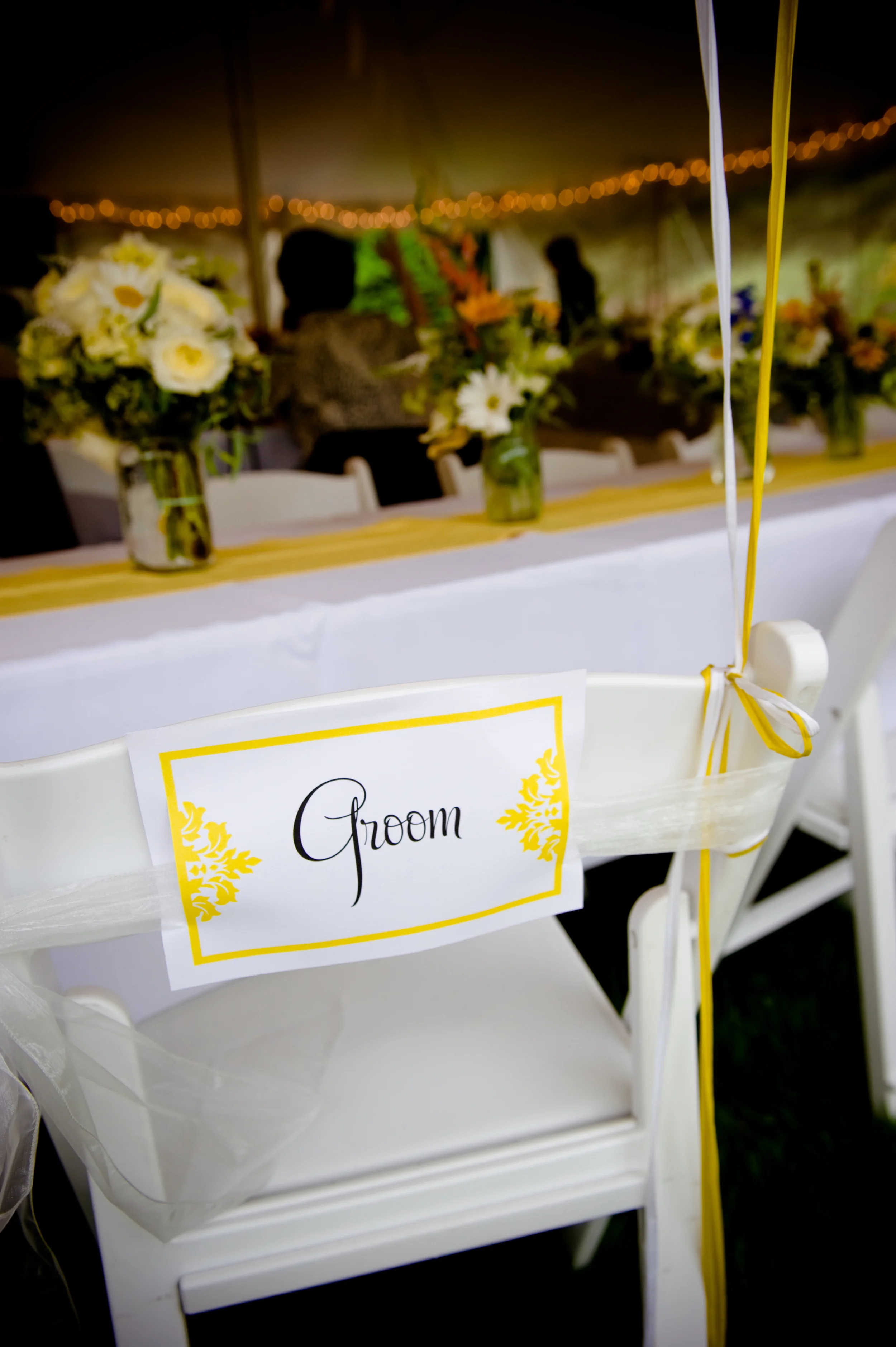
For the invitation design, I wanted something that had an element of formality, letterpress printing holds it’s own as a traditional wedding format, and then I added in a damask detail to maintain that level. I then mixed in a more playful script font with an off centered design to show the balance that our wedding was a casual affair with a bit of tradition mixed in.


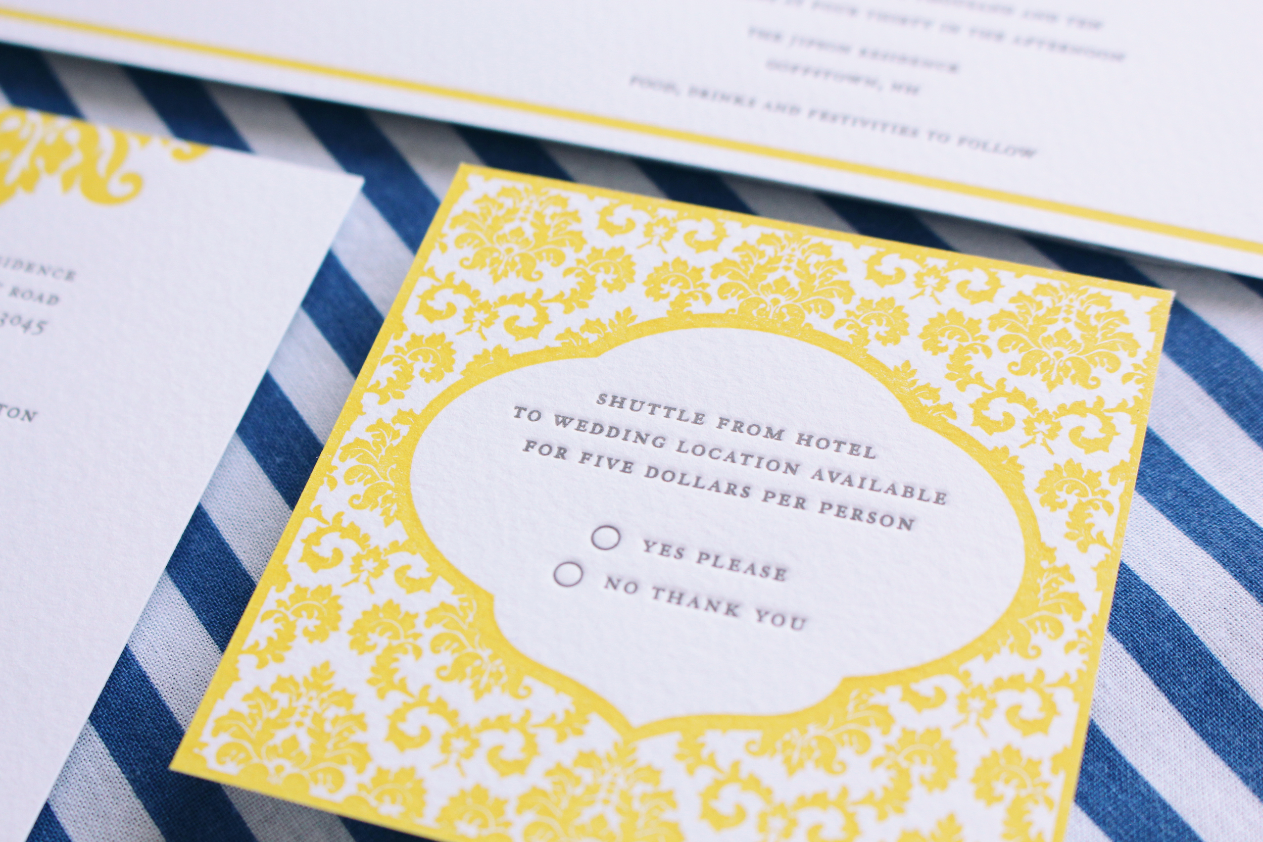
There were some other small paper goods to fill out the suite: address labels that used some of the same shapes from the Save the Date, RSVP card and envelope, accommodation card, and transportation card, all of which had elements from the invitation tied in. I also created a wedding announcement; I wanted the announcement to be a touch more formal, similar to the invitations but not exactly the same. I balanced the design on a central point and used some of the same damask and font elements from the invitation. I also created Thank you cards that were a continuation on the patterns and design from our wedding suite and small return address labels to finish everything out.


I had such a great time designing and creating the paper goods that the rest of the decor just took off from that point. The tone was set from the invitation suite and I just had to fill it in, I wanted my wedding day to feel like a backyard bbq blended with elements of tradition and formality.
My wedding was before the days of Pinterest (gasp) so in some ways it was harder to keep an overall vision in mind when moving forward. Luckily, Danielle and I had already planned many parties together and this was just a larger extension of that. When you are designing an event you quickly realize that there are two main groups that everything falls under: one is logistics and the other is what we call “the pretty”. Yes, there needed to be a tent, tables and chairs, but how would they look? What would make the event have the feeling that I wanted. I quickly became obsessed with the details, the elements that when looked at as a single item seemed small, but when all working together gave the vibe of the day. The tricky thing was to make sure that everything had a “cohesive” look, while walking the fine line between cohesive and matchy-matchy.


For the decor under the tent, we created custom table runners, in the same bright yellow color as the invitations. Our centerpieces were created by a very dear family friend, simple and lovely wildflowers (grown especially for our day) and arranged in mason jars to carry on the ‘backyard’ feel. Overhead we created bunting and a few tissue poms to brighten up the top of the tent, and we also accented the edges and a few small outlying trees with twinkle lights.


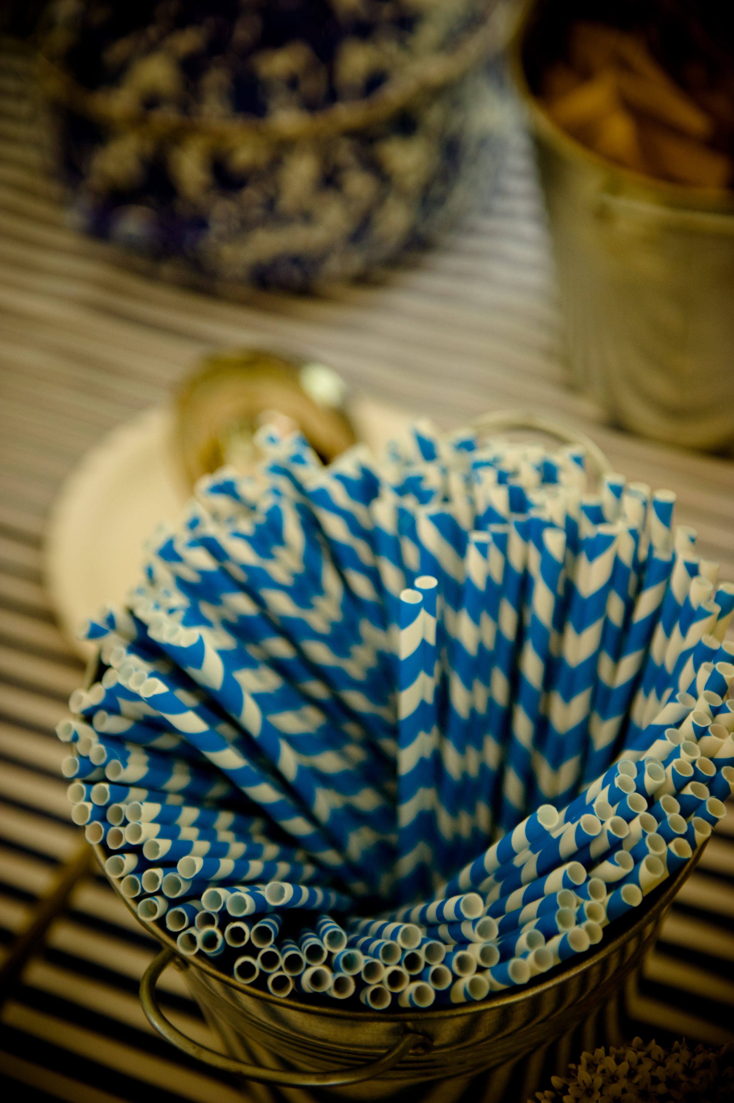
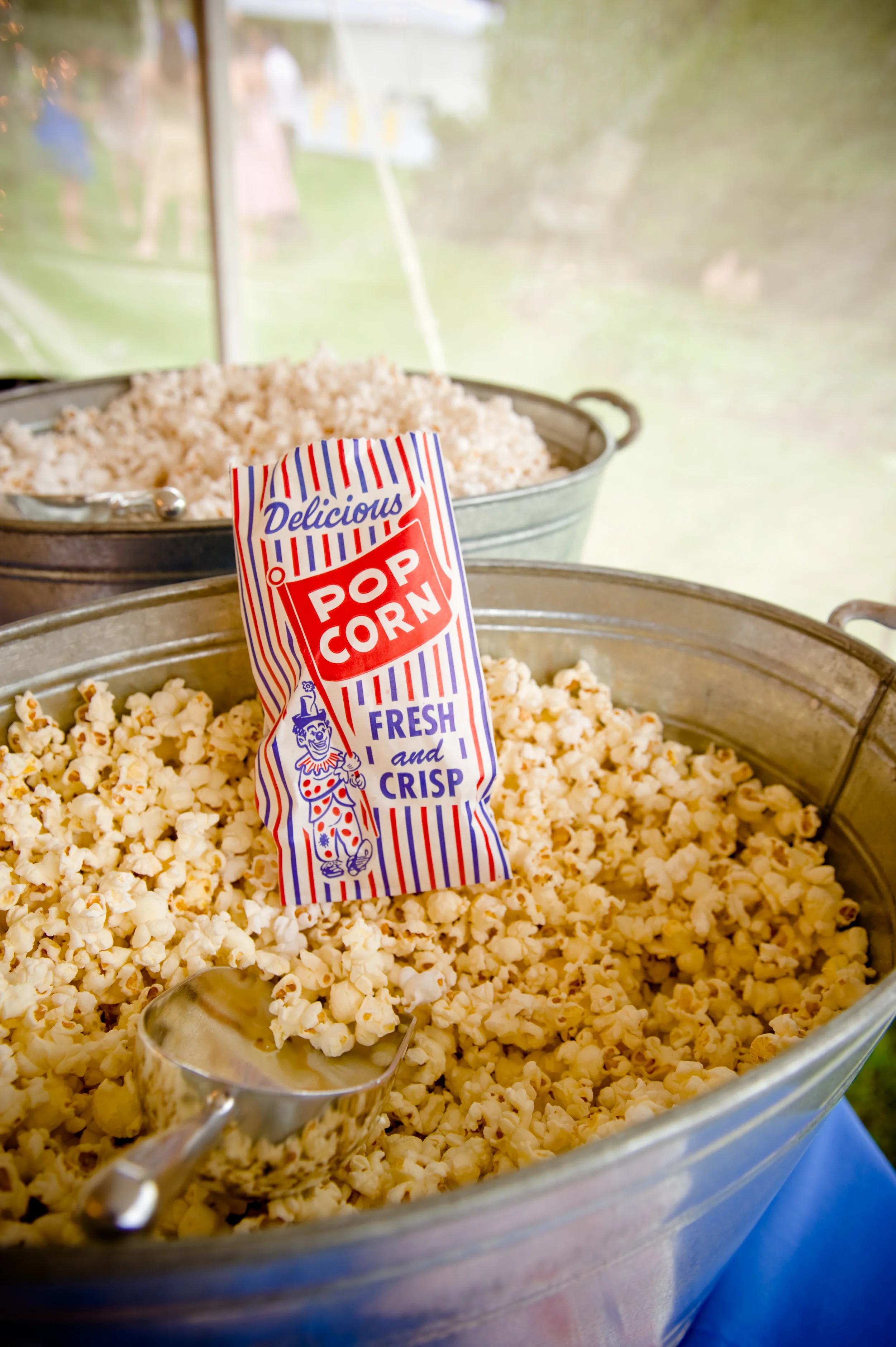
We had a drink station with a blue and white striped tablecloth and three large mason jars with custom labels and wraps that mimicked the shape from the Save the Date. We accented this table with galvanized pails of blue and white striped straws and yellow cups. Of course we had to have snacks before the main event and popcorn in sweet retro bags fit the bill perfectly.


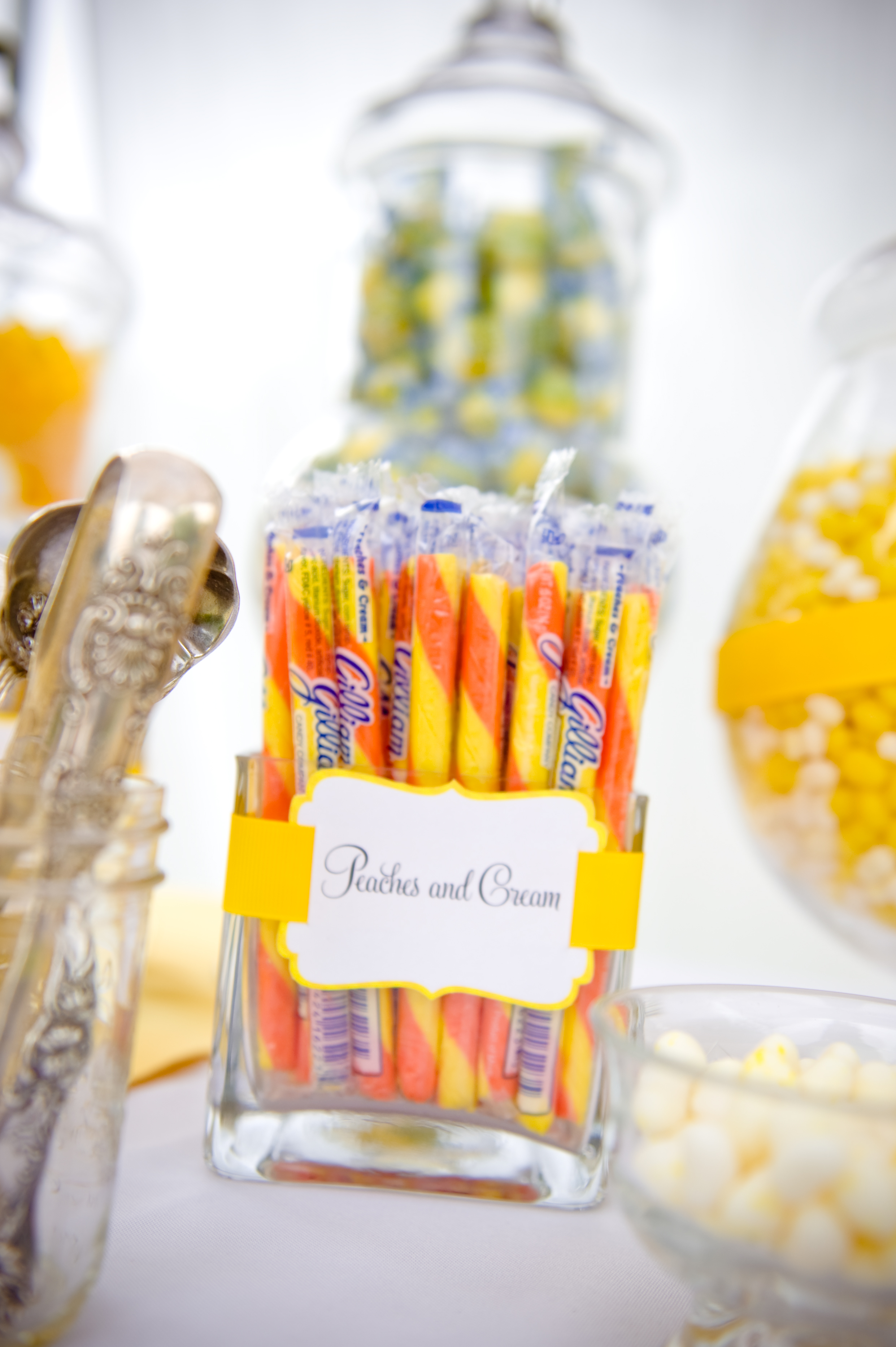
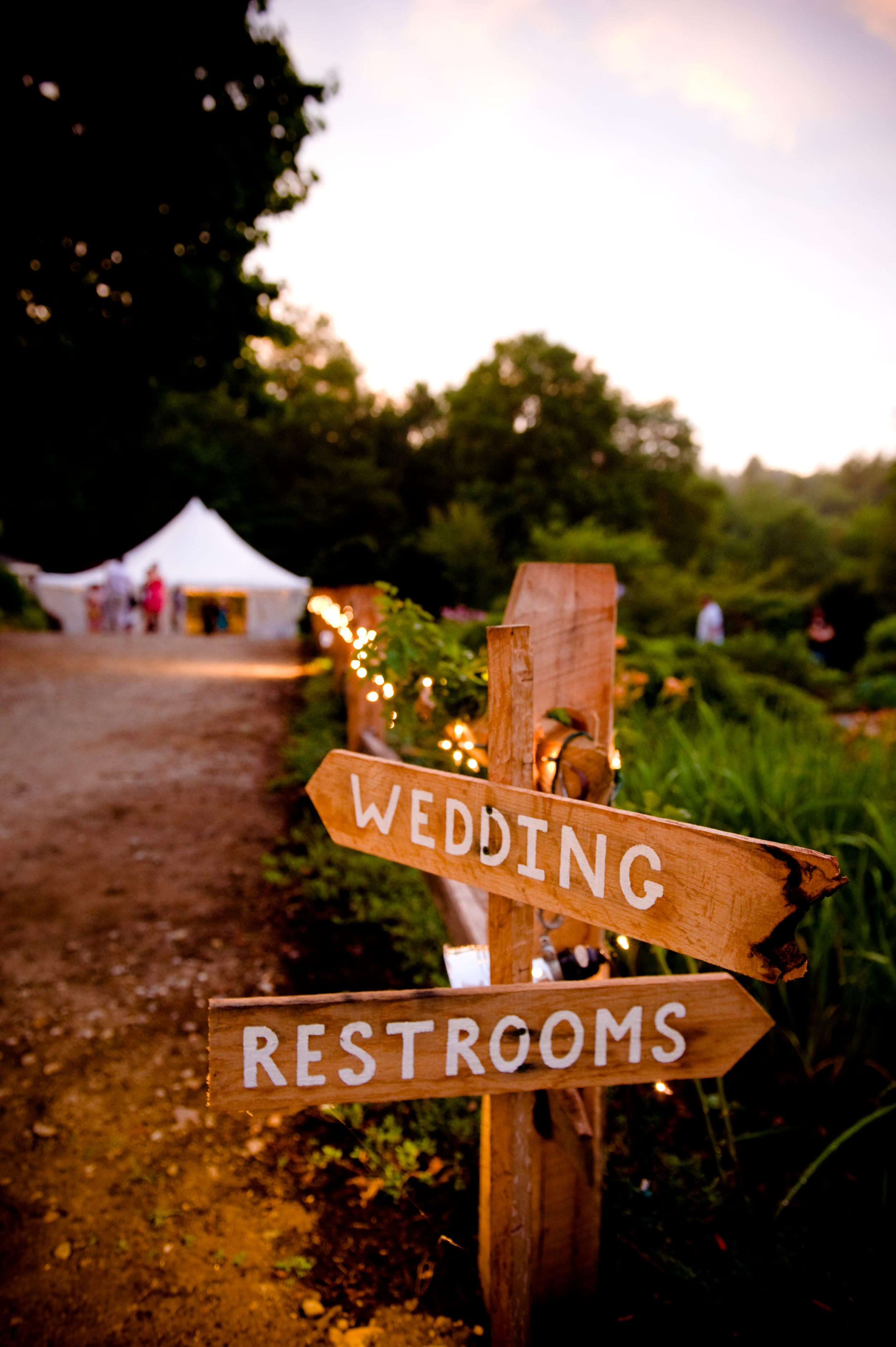
Outside of the tent we had a candy buffet table for sweets and dessert, all dressed in yellow and blue. We had yellow runners that matched the table runners under the tent. And each of the candy vessels was trimmed with ribbon and small labels. Around the yard we had lawn games (bocce, croquet, and cornhole) and blankets and pillows as lawn lounge areas. We also created a custom photobooth backdrop that again repeated yellow and white stripes. Of course we had to direct people to all of these locations, so we hand painted wooden directional signs as well as signs that I designed and had printed for parking, gifts, etc.


In the end, my wedding was start to finish a fully styled event, it is what eventually gave us the idea for our full service package for Champagne & Ink. Starting with a few key ideas: tradition, backyard BBQ, summer appropriate colors of yellow and blue we were able to create a cohesive look and maintain it throughout all of the paper goods and details of the event. We have certainly grown as designers, creative professionals, and as friends in leaps and bounds since my wedding day, but it is fun to look back to where it all started, not only for us and Champagne & Ink, but for my life with my husband.


Venue: Private Residence, Goffstown, NH | Event Photography: Violet Marsh Photography | Paper Goods & Letterpress:Champagne & Ink | Event Design and Decor: Champagne & Ink | Day of Coordinating: Diana Ma Weddings & Events | Rentals:Special Events of New England | Catering: Tennessee BBQ |